-
 RESPONSIVEWEB DESIGN
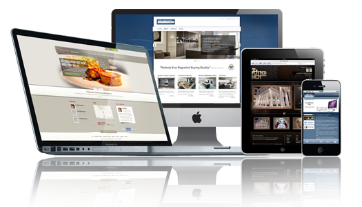
Responsive Design - Inovative look of web design
Almost every new client these days wants a mobile version of their website. It's practically essential after all: one design for the BlackBerry, another for the iPhone, the iPad, netbook, Kindle — and all screen resolutions must be compatible, too. Responsive Web design is the approach that suggests that design and development should respond to the user's behavior and environment based on screen size, platform and orientation.
Overview
In the field of Web design and development, we're quickly getting to the point of being unable to keep up with the endless new resolutions and devices. For many websites, creating a website version for each resolution and new device would be impossible, or at least impractical. Should we just suffer the consequences of losing visitors from one device, for the benefit of gaining visitors from another? Or is there another option?
Responsive Web design is the approach that suggests that design and development should respond to the user's behavior and environment based on screen size, platform and orientation. The practice consists of a mix of flexible grids and layouts, images and an intelligent use of CSS media queries. As the user switches from their laptop to iPad, the website should automatically switch to accommodate for resolution, image size and scripting abilities. In other words, the website should have the technology to automatically respond to the user's preferences. This would eliminate the need for a different design and development phase for each new gadget on the market.
Responsive web design is an innovative approach to website design and development. Essentially, your website is designed and programmed to be fully functional and usable on various screen sizes and devices like PC, Mobile and Tablet etc...
Less Effort
With the help of best responsive web design, you just have to update the information on your web site once. This will definitely lessen your efforts which you have to use in updating many versions of your website.
Smooth User Experience
Best Responsive web design gives users, a very smooth and optimized experience on the device they have in their hands. Recently, it is seen that the world's most famous search engine "Google" started promoting the best responsive web design in their method for the cell phone sites.
Statics
If you are allowing users to use a phone friendly version of your website, then your stats are being split into two. If you want to get complete insight on the visitors on mobile, then you should make a segment named "mobile-only" and this is the feature which makes a Responsive website best.
User Friendly website
One of it's the most famous feature of best responsive web design is that; it makes your website or webpage user friendly. This is because your website can be used on any device of any screen size. Today, there is a huge competition on the invention of technologies and daily a number of smartphones come to the market. Therefore, if you have a best responsive web design, then people will the opportunity to visit your website which is very beneficial for your website.
Mobile Segment
It is also a very good feature of best responsive website that you can get all the useful information about the number of traffic on your website. This requires nothing, you just have to make a mobile segment and you will get the complete view of traffic coming to your website. Traffic updates are very important to note the performance of your website. It also helps you to make changes in your website to increase traffic.
Accumulated Sharing
Best Responsive web design also allows you as a head of website to gather all the social links with one URL. This will help you to make many useful contributions for a best and user friendly website.
Search Engine Optimization (SEO)
Day after day, the search engines are getting very smart and they know how to figure out the connection of mobile websites with the desktop ones. And search engines bring the responsive website on the top of their pages.
No Redirects
It is also one of the best benefits of best Responsive web designing that you will not have to worry about any redirects because it involves not user agent targeting. So, it is a great thing if you are a little irresponsible for taking care of the targeted users and redirects.
Less Maintenance
By making different versions of your website for different devices, you are doing nothing but increasing the load of work. This is because you have to make changes in more than one website. But if your website is a responsive website then you have to maintain it only once. This is because there will be only one layout which works for all sort of devices. This will reduce your efforts and your work load.
Free of Device-Alternating Issues
A very serious problem in designing the website both for mobile and for the desktop is that the users used to share the URL of your website to others. And the people who used to copy the link in their address bar and open it are not always browsing through the same gadget through which the website was shared. This drawback can be effectively removed by the best responsive web design.
It's Not About The Device Only
Best Responsive web design is not just about the device. If you are opening a website on a huge screen, you do not always experience the full screen web browser window. But if you are opening a best responsive website, then you should not care about the screen size. Best responsive web design will never let you do the horrible horizontal scrolling.
Media Display Issues
Perfect responsive web design not only re-sizes the pictures and content, but it also works for the media like videos, moving text, etc. and fix them according to the size of device you have.
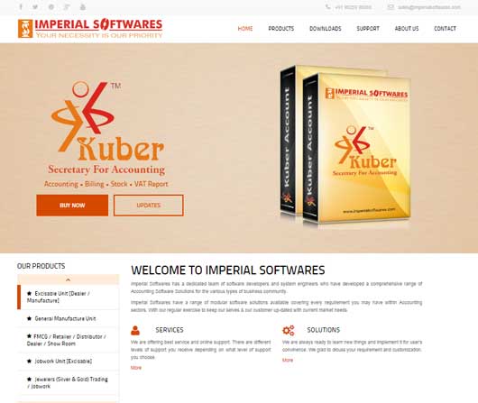
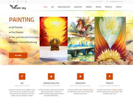
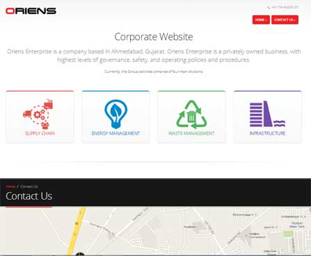
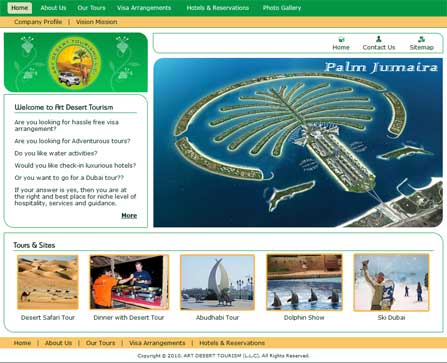
Web Design Portfolio


Why Choose OSCorp?
- Web 2.0 based designs.
- Fast loading websites.
- W3C Validated Designs.
- Cross-browser compatibility.
- PC, Mobile and Tablet compatibility.
- Framework Based Coding.
What Our Customers Say
Working with OSCorp Web Service Group has been fantastic. The transition has been very smooth. I know that I can pick up the phone and they will always be available. That's really what sold me: the responsiveness. We are looking forward to working with oscorp web service group on new projects, based on the good work we've already gotten from them.
- Aditya Joshi, Precision Logo design, India
Indeed, i'm very much pleased with your professional web services which again i must thank you and will continue to work with OSCorp in the future.
- Hussein Kefel, The Top Level Domains, Dubai, U. A. E.